A bit of humor today in the graph of the week section. A friend of mine living in Canada has sent me this short "paper" entitled: "Japan's Phillips Curve Looks Like Japan", by Gregor Smith from Queen's Economic Department.
It turns out that it really does look like Japan:
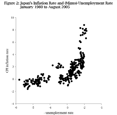
How funny is that? To be fair he had to reverse the unemployment rate to get the mirror image of the initial result (which was a standard downward sloping Phillips curve - in the shape of Japan of course).
Here's a map of Japan (included in the paper) to verify the comparison:
Here's a map of Japan (included in the paper) to verify the comparison:
